ShopDreamUp AI ArtDreamUp
Deviation Actions

PART ONE: INTRODUCTION AND VALUES
Keep in mind: This tutorial only covers focal points. There is a great deal more to be learned about composition and design than what is discussed here.
INTRODUCTION
One of the most important things for an illustrator to understand is focal points. When you get down to the very essence of your piece, your focal point is responsible for your entire composition, the entire meaning, and the allure of the piece. This is something that even professional artists struggle with. I can't tell you how many pieces of art I see everyday that are of a professional level, but have no focal point whatsoever (and should have one).
What is a focal point?
A focal point is the object or person of interest in your image. It is the thing that you want your viewers to look at first and keep returning to as they look at other parts of the image. Focal points mostly apply to full illustrations that have a foreground, middle ground, and background. However, it is advisable not to forget about focal points even when doing simple drawings, paintings or character designs.

The focal point in this image by Trudsss is the character with the weapon.

The focal point in this image by MarcBrunet is the girl, her face especially.
What are the downsides to having no focal point?
Your piece may appear flat, busy, may lack dramatic effect, and may not leave an impression on the viewer even if it's a very complex and detailed piece. Not all pieces of art have to or should have a focal point, but those that do remind me of turning on a light in dark room: they stand out.

This is an example of an image with no focal point.

This image by springonion doesn't need to have a focal point. A focal point would detract from the purpose of this image.
What are the upsides to having a focal point?
The greatest upside to a focal point is being able to properly communicate a meaning of a picture to viewers. If you're doing a painting of Baby Jesus, but people keep looking at a goat off to the side, it'll confuse viewers even though they know what the picture is about! If you do a painting of a man in the shadows but make the rest of the picture too busy and interesting, people may not even notice the man after looking at the picture for a long time!
I have a lot of elements in my picture, how do I choose a focal point?
Let's say you're doing a poster that features a lot of your characters. I would recommend making your main character the focal point.
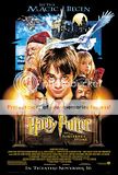
This character poster by Drew Struzan shows Harry Potter being the main point of interest.
Or, perhaps you want to do a painting of a bustling marketplace where there is a lot going on all at once. Though it is nice to capture this slice-of-life moment, don't you think it would be interesting if one particular thing happening in the marketplace got the most attention? Choose the main event/object/character(s) in your image. This will give viewers a "starting place" while their eyes move around your picture.

This marketplace illustration by shirotsuki is very complex with a lot of visuals throughout the image. However, it is clear that the white haired character in front is the focal point (especially their head and face).
HOW TO MAKE A FOCAL POINT: A lesson in value and value contrast
What is value?
Values are black and white, and all the shades of grey inbetween.

Some images will often be lighter, darker or somewhere in the middle. The range of values you use will have different emotional effects on the viewer, and must be considered so that you choose an appropriate value for your focal point. If you have a dark character and put him in a dark environment, make sure some part of him is light. Perhaps his skin, or a weapon, or even rim light silhouetting his shape.

High Key: An image of mostly light values.

Middle Key: An image of mostly grey values.

Low Key: An image of mostly dark values.
What is value contrast?
Value contrast is shades of dark and light in proximity to each other. There can be high contrast, low contrast, and anything inbetween.
High contrast (different values in proximity to each other)
Using high contrast makes your focal point stand out.

Low contrast (similar values in proximity to each other)
It is better to use low contrast away from your focal point.
Value and value contrast are your most valuable weapons in your arsenal to make your focal point stand out. Even if you use color brilliantly, your focal point should always stand out even if your image is in black and white. This is why a lot of professional illustrators will make their images in black and white and then add color on top. This is partly to prevent the focal point and value scheme from getting lost during the coloring process.
How can I use value and value contrast to my advantage?
Let's say your image is very dark. If you made your focal point the lightest point in your image, would it not stand out a great deal? What about vice versa?
:thumb174176582:
In this image of mostly dark (low key) by JenZee, the android's face stands out because it is a light shade and is larger than any other points of light in the image.

In this image of mostly light (high key), by 3-Elements-of-Grey, the girl's dark hair against light colored surroundings makes her the focal point.
It is possible to have good contrast in middle grey (middle key) images as well.

This image by kidchan shows the middle character in white standing out against his/her clones.
Abstract Process
Sometimes you have to forget that your image is full of "things" and focus on the values and contrast as if they are "blobs." If you percieve images in this abstract manner, it's easier to figure out what to do. I will change this abstracted image that has no focal point into one that does.
--> 
By making the other objects similar in value and giving the focal point the highest contrast, I was able to easily make the focal point identifiable.
Test Your Eye
Can you tell how these artists where able to point out their focal points by utilizing value?

By Fabio-Barboni
By chocosweete
By weem
I hope you found Part One useful. If you have any questions, arguments, points to add, find any spelling or grammatical errors, or find something confusing, please feel free to comment below.
-Dyl
Coming soon:
PART 2: (Shape)
PART 3: (Color)
PART 4: (Analysis + Conclusion)
Keep in mind: This tutorial only covers focal points. There is a great deal more to be learned about composition and design than what is discussed here.
INTRODUCTION
One of the most important things for an illustrator to understand is focal points. When you get down to the very essence of your piece, your focal point is responsible for your entire composition, the entire meaning, and the allure of the piece. This is something that even professional artists struggle with. I can't tell you how many pieces of art I see everyday that are of a professional level, but have no focal point whatsoever (and should have one).
What is a focal point?
A focal point is the object or person of interest in your image. It is the thing that you want your viewers to look at first and keep returning to as they look at other parts of the image. Focal points mostly apply to full illustrations that have a foreground, middle ground, and background. However, it is advisable not to forget about focal points even when doing simple drawings, paintings or character designs.
The focal point in this image by Trudsss is the character with the weapon.
The focal point in this image by MarcBrunet is the girl, her face especially.
What are the downsides to having no focal point?
Your piece may appear flat, busy, may lack dramatic effect, and may not leave an impression on the viewer even if it's a very complex and detailed piece. Not all pieces of art have to or should have a focal point, but those that do remind me of turning on a light in dark room: they stand out.
This is an example of an image with no focal point.
This image by springonion doesn't need to have a focal point. A focal point would detract from the purpose of this image.
What are the upsides to having a focal point?
The greatest upside to a focal point is being able to properly communicate a meaning of a picture to viewers. If you're doing a painting of Baby Jesus, but people keep looking at a goat off to the side, it'll confuse viewers even though they know what the picture is about! If you do a painting of a man in the shadows but make the rest of the picture too busy and interesting, people may not even notice the man after looking at the picture for a long time!
I have a lot of elements in my picture, how do I choose a focal point?
Let's say you're doing a poster that features a lot of your characters. I would recommend making your main character the focal point.

This character poster by Drew Struzan shows Harry Potter being the main point of interest.
Or, perhaps you want to do a painting of a bustling marketplace where there is a lot going on all at once. Though it is nice to capture this slice-of-life moment, don't you think it would be interesting if one particular thing happening in the marketplace got the most attention? Choose the main event/object/character(s) in your image. This will give viewers a "starting place" while their eyes move around your picture.
This marketplace illustration by shirotsuki is very complex with a lot of visuals throughout the image. However, it is clear that the white haired character in front is the focal point (especially their head and face).
HOW TO MAKE A FOCAL POINT: A lesson in value and value contrast
What is value?
Values are black and white, and all the shades of grey inbetween.
Some images will often be lighter, darker or somewhere in the middle. The range of values you use will have different emotional effects on the viewer, and must be considered so that you choose an appropriate value for your focal point. If you have a dark character and put him in a dark environment, make sure some part of him is light. Perhaps his skin, or a weapon, or even rim light silhouetting his shape.
High Key: An image of mostly light values.
Middle Key: An image of mostly grey values.
Low Key: An image of mostly dark values.
What is value contrast?
Value contrast is shades of dark and light in proximity to each other. There can be high contrast, low contrast, and anything inbetween.
High contrast (different values in proximity to each other)
Using high contrast makes your focal point stand out.
Low contrast (similar values in proximity to each other)
It is better to use low contrast away from your focal point.
Value and value contrast are your most valuable weapons in your arsenal to make your focal point stand out. Even if you use color brilliantly, your focal point should always stand out even if your image is in black and white. This is why a lot of professional illustrators will make their images in black and white and then add color on top. This is partly to prevent the focal point and value scheme from getting lost during the coloring process.
How can I use value and value contrast to my advantage?
Let's say your image is very dark. If you made your focal point the lightest point in your image, would it not stand out a great deal? What about vice versa?
:thumb174176582:
In this image of mostly dark (low key) by JenZee, the android's face stands out because it is a light shade and is larger than any other points of light in the image.
In this image of mostly light (high key), by 3-Elements-of-Grey, the girl's dark hair against light colored surroundings makes her the focal point.
It is possible to have good contrast in middle grey (middle key) images as well.
This image by kidchan shows the middle character in white standing out against his/her clones.
Abstract Process
Sometimes you have to forget that your image is full of "things" and focus on the values and contrast as if they are "blobs." If you percieve images in this abstract manner, it's easier to figure out what to do. I will change this abstracted image that has no focal point into one that does.
--> By making the other objects similar in value and giving the focal point the highest contrast, I was able to easily make the focal point identifiable.
Test Your Eye
Can you tell how these artists where able to point out their focal points by utilizing value?
By Fabio-Barboni
By chocosweete
By weem
I hope you found Part One useful. If you have any questions, arguments, points to add, find any spelling or grammatical errors, or find something confusing, please feel free to comment below.
-Dyl
Coming soon:
PART 2: (Shape)
PART 3: (Color)
PART 4: (Analysis + Conclusion)
MOVED, NEW ACCOUNT
~ArandaDill (https://www.deviantart.com/arandadill) :iconarandadill: :iconarandadill: :iconarandadill: :iconarandadill: :iconarandadill: :iconarandadill:
ArandaDill (https://www.deviantart.com/arandadill)
All of my art and I have moved to a new account! I've also posted years of past work there as well. If you watched me for these, they're all over there now: :)
:thumb268779144: :thumb268779087:
:thumb268779159: :thumb268778978:
:thumb268779206: :thumb268779102: :thumb268778993:
I apologize to those who've already rewatched me once already. I understand if you're fed up with my indecision, but I've been tackling this for a while and I've come to the conclusion that I shouldn't use pseudonyms and should ju
Check it out!
Check out ambisweetiepie (https://www.deviantart.com/ambisweetiepie)'s Etsy Shop! She has made keychains for Pokemon, Adventure Time, Katamari Damacy, Evangelion, tea + coffee lovers, and more! I have the president Aria one. (Gold stars to anyone who has read the Aqua and Aria manga. If you're ever looking for a slice-of-life manga that takes place in a sci-fi revision of Venice, then look no further.)
They really are quite cute and well-made. Please support her by stopping by her shop! :)
PS: I've also recently discovered the wonderful world of blue Col-erase Pencils. Holy crap you guys. I can draw on paper like how I draw in Photoshop. It's like MAGIC.
Personal style
Happy Halloween everyone!
Unfortunately, no new art will be put up this week. I botched the class assignment I spent all day Sunday on (I got everything right except one detail, but that detail is so important that I have to do the project over :XD:) and have to spend the time I usually set aside for personal art to re-do my assignment. It's too bad, but if I don't do it then I get no credit at all.
I've also learned something interesting today: Style is something you develop over time as is part of your personal artistic identity. If you're worried about the individuality of your style, then keep learning, keep being inspired and eventuall
Quick Copyright Symbol for descriptions EDIT
©©©©©©©©©©©©
When you submit your art, scroll to the bottom of the submission page, copy the copyright symbol, and paste it into your description.
I just thought I'd mention this because I realize a lot of people go through some lengths to get the copyright symbol into their description. It's everywhere on dA though, so just copy/paste. :nod:
EDIT: If you have a Mac, Option+g produces a copyright symbol. Thanks, arvalis (https://www.deviantart.com/arvalis).
EDIT2: Alt+0169 also works to add a copyright symbol. Thanks, Rina-ran (https://www.deviantart.com/rina-ran)
©©©©©©©©©©©©
© 2011 - 2024 DylanFurst
Comments25
Join the community to add your comment. Already a deviant? Log In
Guess how much I love you right now.